007
MX
Art Direction
When I joined MX, the company had recently completed a rebrand and rename. Formerly known as MoneyDesktop, the shift reflected the industry's move from desktop-only to mobile-first banking. My prior experience with rebranding informed my approach as I art directed collateral and built systems to extend the identity — clean backgrounds, a refined palette, and purposeful typography that reflected how the company operated.
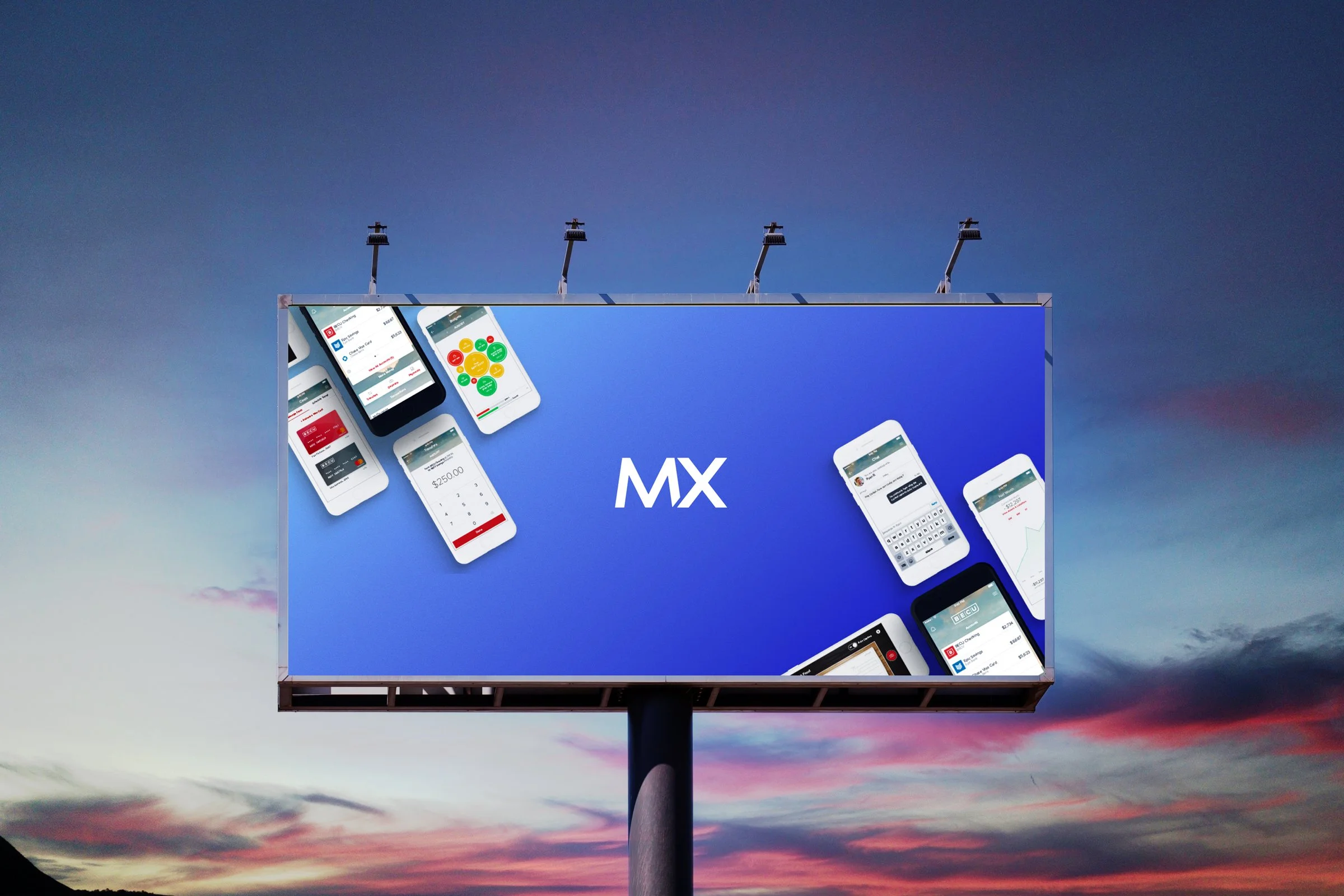
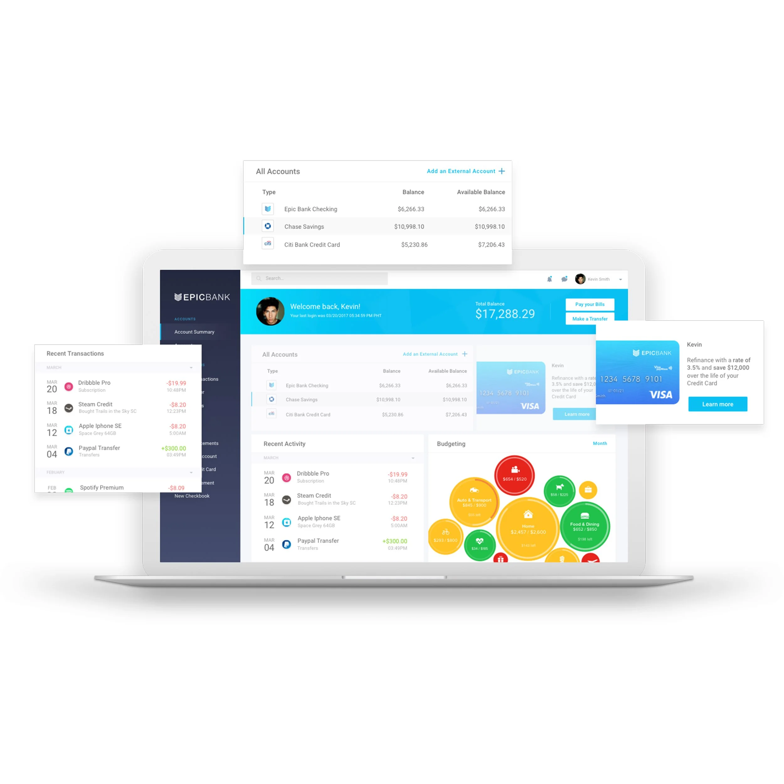
I developed the sub-brand architecture and established standards to scale across future product lines. Color choices were made deliberately — warm and approachable, positioning MX as a technology platform that felt intuitive rather than institutional. The refreshed system gave the sales team a cohesive visual language for showing prospective clients what their digital banking experience could look like.
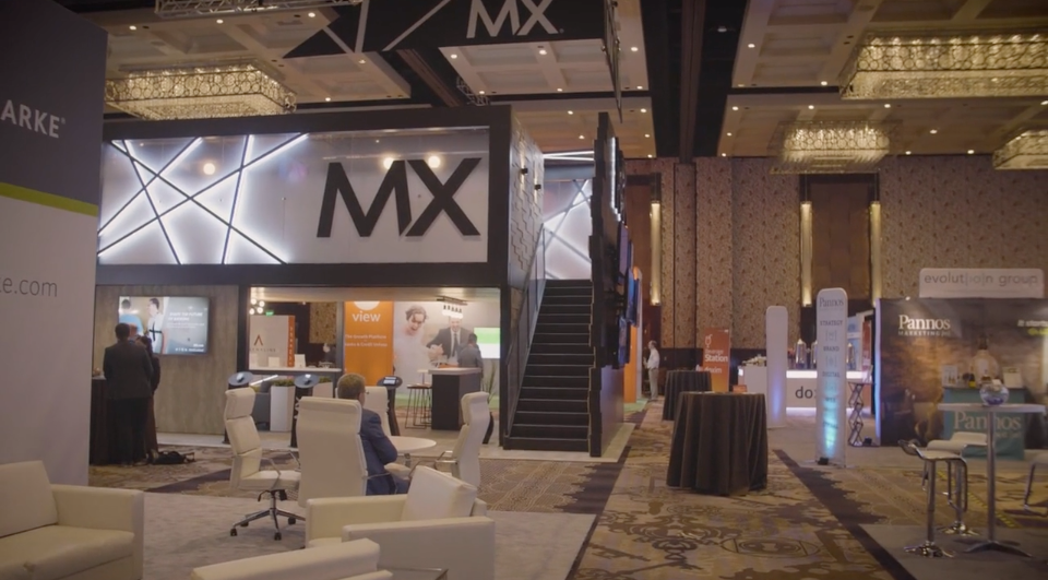
The identity also extended to MX's flagship annual conference, where I created a new event logo and full sub-brand for clients, peers, and investors. A 20×20 double-decker trade show booth followed, directly inspired by MX's corporate offices — black concrete and warm oak translated into a modular, travel-ready environment that felt unmistakably on-brand.
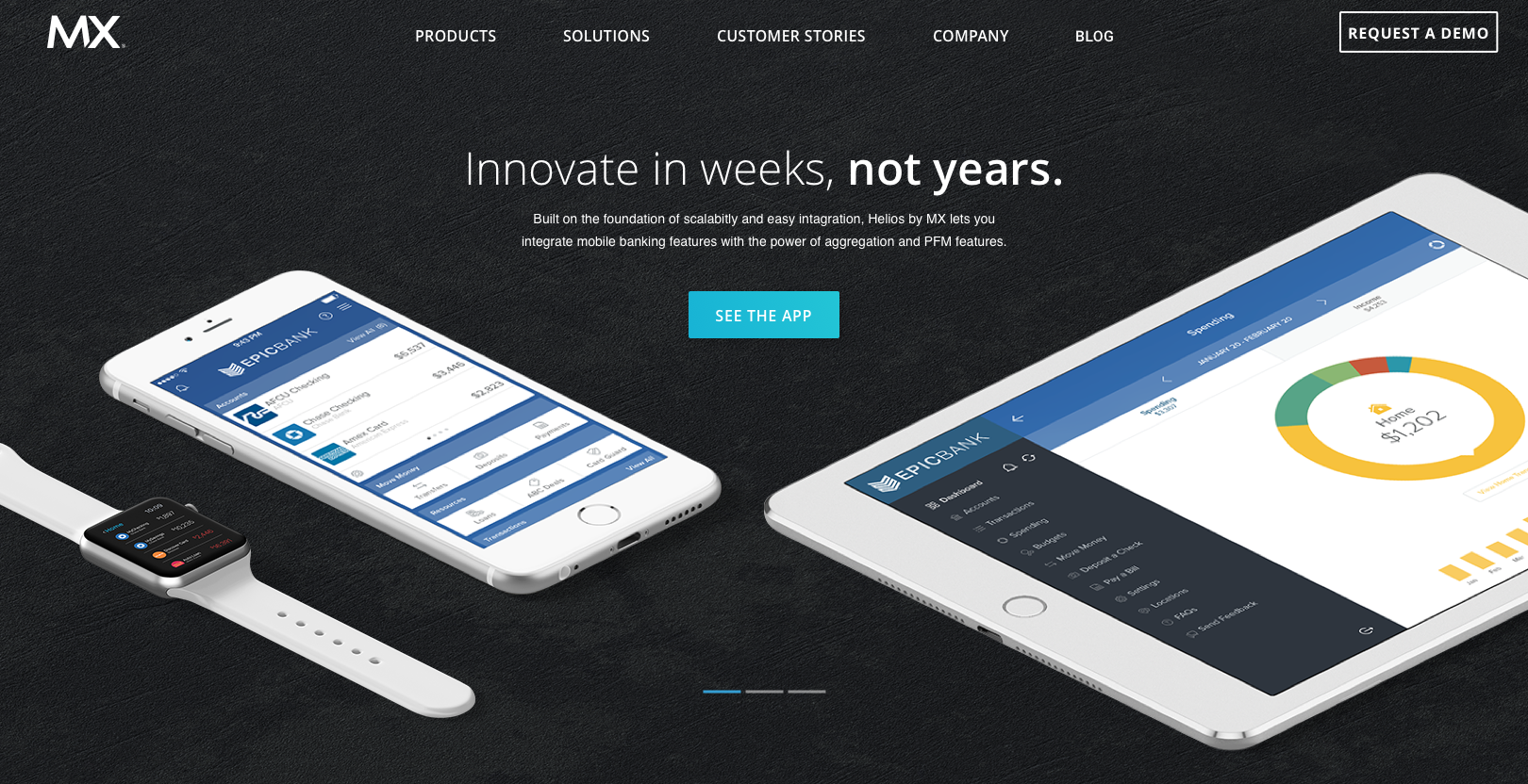
Finally, the refresh carried through to the website. Devices were kept white and light to foreground the platform's UI, while office textures and the new palette were woven throughout — striking a balance between cutting-edge technology and an experience designed to make users feel in control of their finances.